lutheran healthcare branding
The Lutheran Medical Center main entrance on 2nd Avenue before and after renovation and branding (drag the icon left or right to see the difference).
Problem:
After more than a century serving Sunset Park Brooklyn, Lutheran Health Care had grown from a faith-based hospital into a comprehensive lifetime health care delivery system with community health centers throughout southwest Brooklyn. The growth was largely through the merger of separate provider organizations. It was time for a new brand image. It needed a simplified nomenclature and unifying brand identity to communicate the transformation and the continuity of care offered.
An Ernst and Young strategic plan commissioned by the hospital had identified several key issues: 1) There was an institutional need to integrate into a comprehensive system; 2) All the necessary parts now existed within the organization; 3) but those parts operated and represented themselves largely as separate entities.
These factors contributed to perception issues in the community that drove a percentage of consumers to hospitals in Manhattan and Staten Island.
Then, after searching for about a decade for a new president, the system finally hired Wendy Goldstein as President and entered a new era of leadership. A re-branding was launched.
Solution
The name was changed to Lutheran Health Care from Lutheran Medical Center and a new logo and type treatments were developed. In addition, a distinctive graphic device of a long banded vertical gradient was introduced to represent the evolution of the institution, the continuity of lifetime care it offered, and the communities it served for more than a century. These communities, primarily Sunset Park, Bay Ridge, and Park Slope, comprised a dynamic, multi-ethnic, multi-lingual, multi-cultural catchment of families, many of which were transitioning over generations from immigrants to first and second generation Americans and beyond. The new look & feel was then iterated consistently and systematically across multiple touchpoints. These included environmental (signage and wayfinding), vehicles, stationery, literature, and advertising, etc.
A new logo and type treatment were developed and a distinctive graphic device of a long, banded, vertical gradient introduced reflecting the lifetime of care offered and the generations of families, many transitioning from immigrants to first and second generation Americans and beyond.


The new look & feel was iterated consistently and systematically across multiple touchpoints including environmental (signage and wayfinding), vehicles, stationery, literature, and advertising, etc.
Project: Lutheran Healthcare Branding
Agency: BrandAgents
Client: Lutheran Health Care, Wendy Goldstein, President; Robert Walsh, VP Community Relations; Nancy Tutolo, Marketing Director
Brand: Lutheran Health Care
Category: Hospitals, Branding
Role: Creative Director, Principal
Skills: Branding, Design, Project Management, Strategy, Planning, Account Management
Software: Adobe Photoshop , Adobe InDesign, Adobe Illustrator, Microsoft Project, Microsoft Excel, Clients & Profits
Description: Branding design and execution for Lutheran Health Care system, consisting of a 500 bed level 1 medical center and community health center network, etc.
environmental
[hotspotitem] Lutheran Medical Center main entrance on 2nd Avenue designed by Perkins Eastman Architects:
 [/hotspotitem]
[hotspotitem]
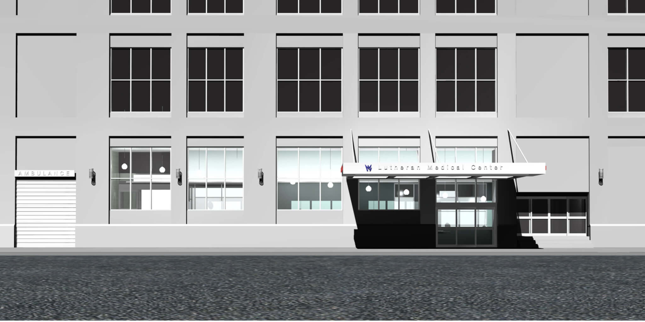
The Sunset Park Family Health Center entrance on 55th Street designed by Breger Terjesen Associates Architects:
[/hotspotitem]
[hotspotitem]
The Sunset Park Family Health Center entrance on 55th Street designed by Breger Terjesen Associates Architects:
 [/hotspotitem][/cq_vc_hotspot]
PROBLEM: there were two incongruent architectural designs in progress. They were commissioned by two different divisions of the health care system for different sides of the same building. Perkins Eastman Architects was designing the hospital’s main entrance on 2nd Avenue and Breger Terjesen Associates Architects was designing the Sunset Park Family Health Center’s main entrance on 55th Street.
SOLUTION: Bob Walsh, Lutheran Medical Center’s Senior VP of Community Relations asked BrandAgents to develop a unifying environmental brand vision and work with, and direct, internal stakeholders (including engineering) and external stakeholders (including two architecture firms).
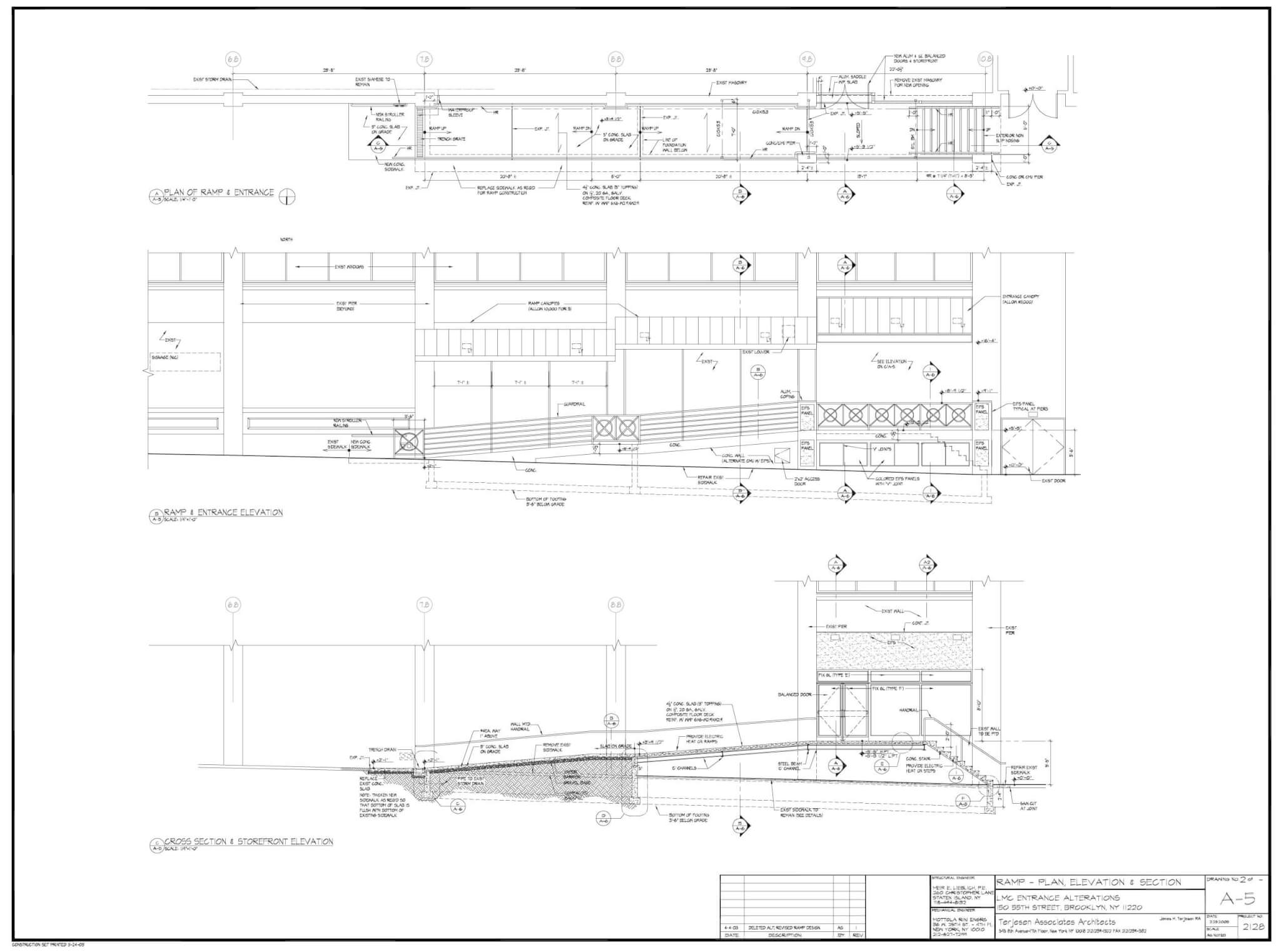
Above: The Sunset Park Family Health Center 55th Street entrance concept. BrandAgents conceived of a distinctive, hard to copy gradient graphic device that could be iterated across multiple locations and brand touchpoints. It complimented the logo and simply created a unique, modern look & feel while fostering brand continuity. Produced by a state-of-the-art digital printing process, it could be produced several blocks long. There was nothing quite like it. It helped protect the brand from plagiarism because it was technically hard to imitate and very few vendors had the necessary equipment. BrandAgents executed a procurement process to select a vendor for production and installation and coordinated and directed key internal and external stakeholders to achieve it. Drawings were obtained from the engineering department and architecture firms. These were combined precisely into single digital files and the graphics were overlayed over them. The resulting comprehensives accurately communicated the vision to the client for approval and stakeholders and vendors for estimating and production. They set a proofing standard for matching and quality control.
Concepts


Above: precise comprehensives ensured faithful production fidelity of the client approved concepts.
Lighting Design


Above and below: lighting concepts pre-production material tests and accurate comprehensives facilitated client design decisions and faithfully predicted results.
wayfinding


vehicles


stationery, literature, and advertising


Project: Lutheran Healthcare Branding
Agency: BrandAgents
Client: Lutheran Health Care, Wendy Goldstein, President; Robert Walsh, VP Community Relations; Nancy Tutolo, Marketing Director
Brand: Lutheran Health Care
Category: Hospitals, Branding
Role: Creative Director, Principal
Skills: Branding, Design, Project Management, Strategy, Planning, Account Management
Software: Adobe Photoshop , Adobe InDesign, Adobe Illustrator, Microsoft Project, Microsoft Excel, Clients & Profits
Description: Branding design and execution for Lutheran Health Care system, consisting of a 500 bed level 1 medical center and community health center network, etc.